
Wedding branding suite
Wedding branding and materials for two highly creative people - Stacey Rozich and Sam Macon.

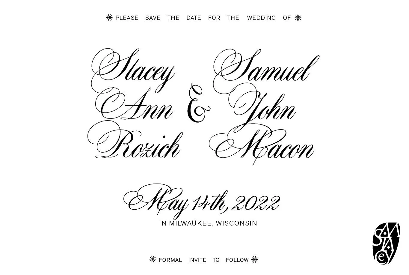
Formal Save-The-Date

Formal Invite
Botanical Logo

Style
Lush, floral tapestry-like patterns combined with bold illustrative script, invokes a feeling of nobility and virtue.

Logo
Early concepts for Sam & Stacey’s monogram logo. I wanted it to be visually appealing and architectural, but also needed to be legible.

Revisions
Options with varying “A” and “E” treatments.

Finalized Logo
Finalized logo and shape. Final logo included more legibility for the “Stacey” letter placement.
Early save-the-date concepts


Final save-the-Date

Front
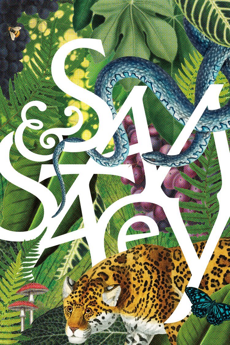
The chosen logo direction along with some personal favorite objects within the art chosen by Stacey and Sam.

Back
The back of the save-the-date includes the addition of some of the botanicals from the front, along with the logomark down in the corner.
Secondary logo inspiration
I wanted to create a secondary logo that utilizes the negative space to reveal the logomark in a bold way. Working within the established style of botanicals, I took the direction of vectorized flora and fauna.

Direction & sketch
My first rough pass at the design.

Finalized logo
When filling the space, I gave myself the goal to not use same plants twice and also to try and not use one large plant to fill a large area.

Detail

Formal invite
Front
Gold foil fills the logo surrounded by a monotone garden arrangement similar to a toile or wallpaper.


back
Continuing the with branding style, botanicals and the illustrative script are carried through for the formal invitation.