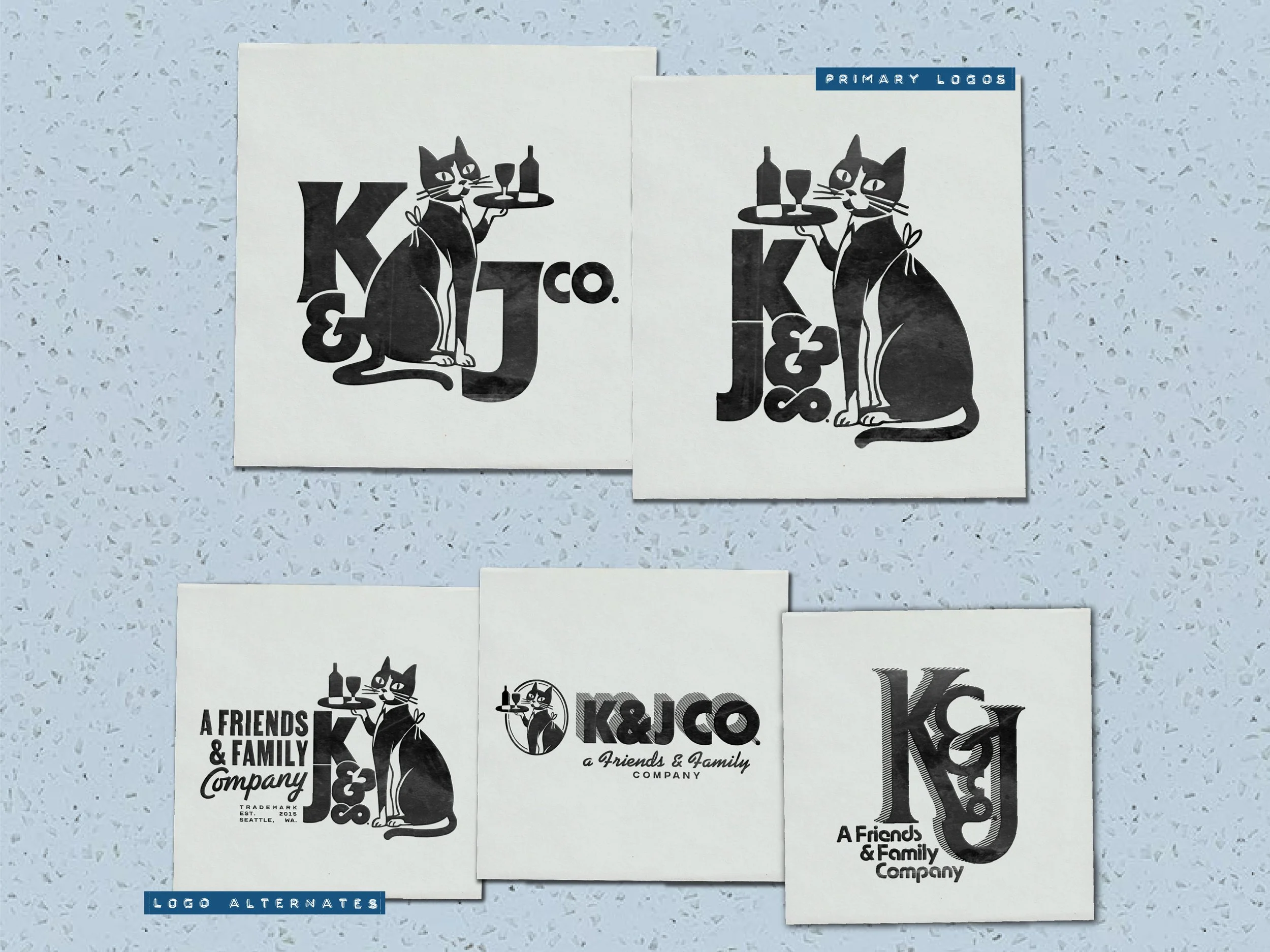
K&J co.
I wanted a wedding logo that didn’t scream “wedding logo,” and favors that wouldn’t die the day after the party. When I was concepting how to brand ourselves, I kept thinking about how our friends and family come together to create this fun little collective—basically, a "company" of sorts. So we took Kelly + Jason, trimmed it to K + J, slapped on a “Co.,” and boom: a brand was born. Voilà!
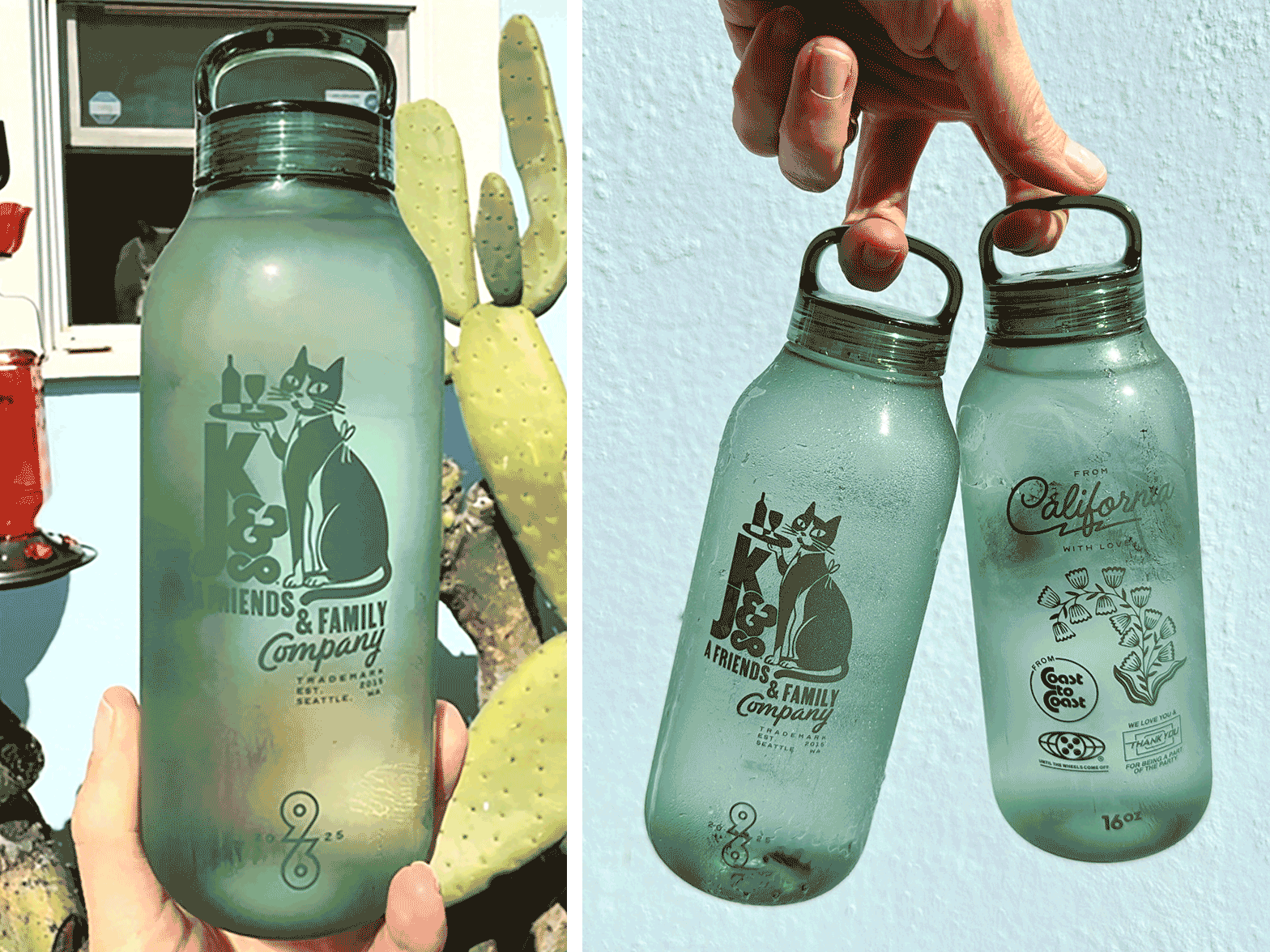
I pictured something with a retro, 1970s corporate/old-school restaurant vibe—like it belonged on a vintage letterhead or a well-worn receipt. And since I’m a sucker for logos with dignified, job-holding animals, it only made sense to feature our cat, Birdie. So there she is: all dressed up in a black tie and apron, playing bartender and serving drinks like she’s been on staff for decades.
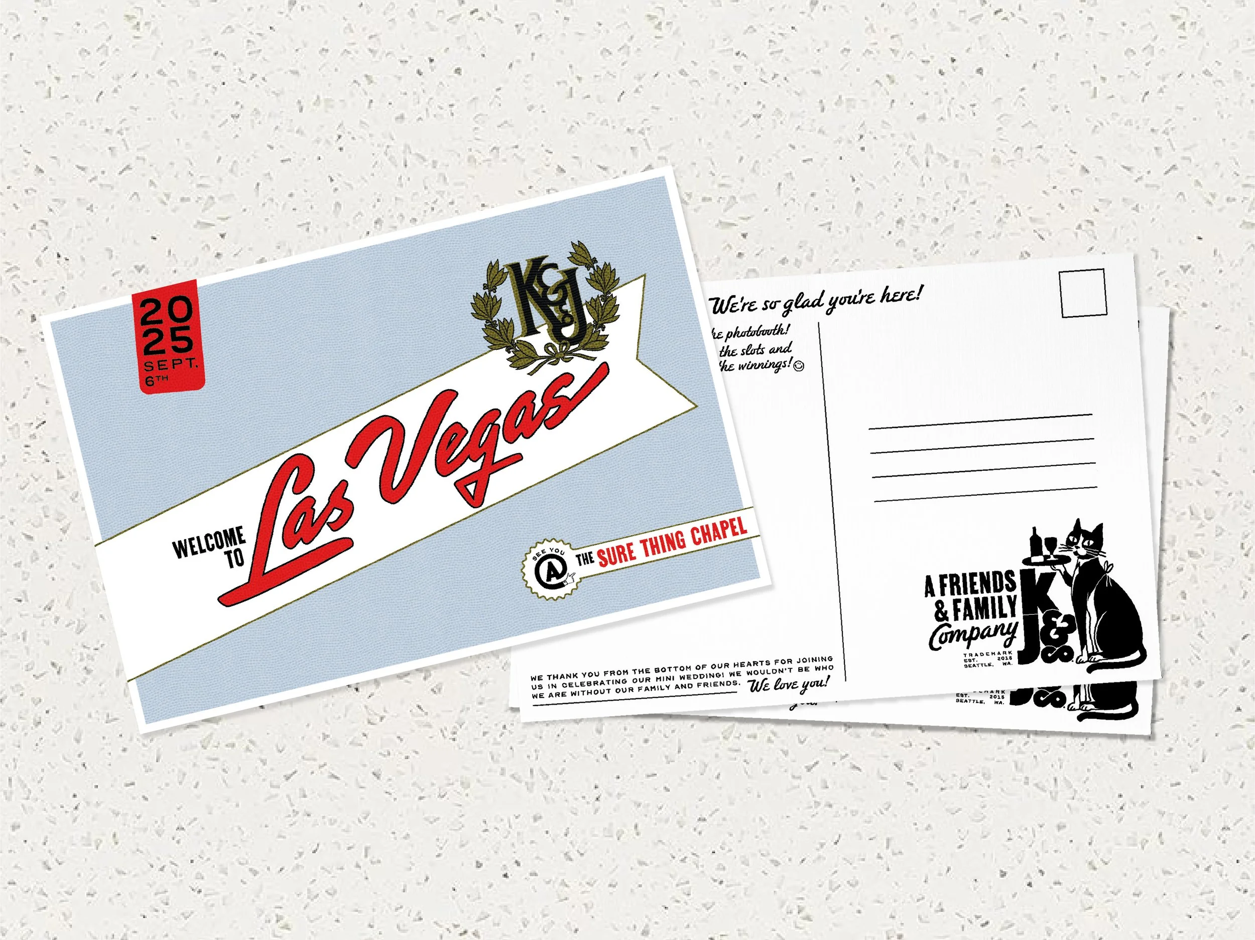
Also, I had a great time designing our custom printed, tone-on-tone (PMS matched too!) reusable water bottles, chocolate bars (the design has a slight nod to Sees Candies 🤫), matchbooks, treat hang tags and a postcard for the wedding day that was attached to the favor bags that greeted guests and instructed them to use the photobooth in the chapel.